Stamp Layering With One Ink Color + GIVEAWAY

Hello. Today’s video shares how to do stamp layering with one ink color. Stamp layering is when you stamp several images on top of each other to create a realistic look. Unfortunately, you usually need several colors/shades of ink to achieve this. Until now! In my video I share a way to use one color of ink along with a tool you most likely already own.

061916-One-Ink-Layering4-Jennifer-McGuire-Ink

[All supplies are linked to multiple sources in the thumbnails at the end of this post. Compensated affiliate links used at no cost to you. To watch the video in HD on YouTube, click HERE.]

There are a couple ways you can use stamp layering stamp sets with one color/shade of ink. One option is to stamp the first layer once. Then double stamp the second layer to get a slightly darker shade. And triple stamp the third layer for even darker. However, sometimes this isn’t very effective and the image just looks flat. I have had much more success with today’s trick and am hoping it works for you, too.

For this technique, you need one color dye ink pad. That’s it! You will also need one tool to use with it – a good white pigment ink. You could argue that that is another “color” of ink, but I really look at as a tool here. 🙂 And you can team it up with any color of ink.

061916-One-Ink-Layering9-Jennifer-McGuire-Ink

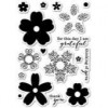
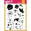
For the flowers, I stamped the first layer images of the WPlus9 Freehand Florals using a color dye ink. (Colors are listed in the thumbnails below.) I then stamped the same images directly on top using white pigment ink… and the white pigment mutes the color underneath… leaving a beautiful velvet look. I then stamped the next layer with the color ink followed by another layer of white. Finally, I finished with the last stamp layer with color.

So basically, I’m stamping that solid image using white pigment ink between each layer image. This allows you to lighten each layer of color that you put down so the next layer of color will look even darker.

061916-One-Ink-Layering1-Jennifer-McGuire-Ink

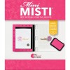
I finished off the cards by stamping the large sentiment from the Honey Bee Bless Your Heart Stamps using Black VersaFine and clear heat embossing it. (I have to say that this stamp set is by far my favorite of 2016 so far. I just love it!) Since I made several cards of the same design, I used my Mini Misti Stamping Tool to stamp all the greetings.

061916-One-Ink-Layering2-Jennifer-McGuire-Ink

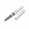
I added some Wink of Stella Clear Glitter Brush Marker to the flowers and die-cut the panel using a frame die from the Mama Elephant Dotted Details Dies. I also wanted to add splatter to my card but I have control issues. (Who’s with me!? lol) Instead, I used the Distressed Patterns Stamp Set by My Favorite Things and stamped the splatters using a silver metallic ombre ink pad from Hero Arts. This way I don’t have to panic on where the splatters land. Isn’t that shine fun?

061916-One-Ink-Layering7-Jennifer-McGuire-Ink

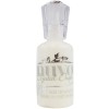
This technique will work with a variety of stamps. I chose to stamp a few of my cards using some new sets from Memory Box/Poppy Stamps. I also switched up the finishing touches in a few examples and used Nuvo drops as an accent. They come in a variety of colors and create drops similar to enamel dots. I like white the best! This card features the Memory Box Flourish Blooms Stamps…

061916-One-Ink-Layering6-Jennifer-McGuire-Ink

And this one uses the Memory Box Ornamental Butterflies Stamps…

061916-One-Ink-Layering8-Jennifer-McGuire-Ink

And here is the card I did weeks ago that I used as an inspiration for today’s cards. Sometimes when I am stumped on a design, I “lift” something I made in the past. It works!

061916-One-Ink-Layering4=5-Jennifer-McGuire-Ink

A white pigment ink pad is such a great tool to have in your crafty stash. There are so many techniques you can do with it, like this one. I hope you give it a try!

GIVEAWAY

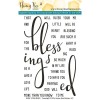
How would you like to win the fabulous Honey Bee Bless Your Heart Stamp Set? For your chance, leave a comment below by 11:59pmEST on 6/29/16 telling me your favorite color of ink. (The winner’s name will be randomly selected, emailed and posted on my “Winners page” after the giveaway closes. International folks are eligible, too!)

SUPPLIES

Interested in the products I used? To make them easy for you to find, I have listed them below. (Compensated affiliate links used at no cost to you. Affiliate and product disclosure can be found here. All products were personally purchased except those with an asterisk. As always, this post was NOT sponsored.) Click on the letters below each picture to go to a favorite store: Simon Says Stamp (SSS), Ellen Hutson (EH), Amazon (AZ), etc.
Leave a Comment

695 thoughts on “Stamp Layering With One Ink Color + GIVEAWAY”

  1. Rebecca Reynolds says:
    I love that Blessed stamp set! Great card! My favorite color of ink is DIstress INk Peacock feathers. I use it all the time.

  2. Susan G. says:

    what a splendid solution. I have purchased a few of these type of flower stamps but do not own 3 shades of any color. I have used stamping off and double stamping, but the effect is not what I had hoped for. I do have white ink pad, so will give it a try with some Blackberry Bliss (Stampin’ Up color just discontinued, sadly) as this is my current favorite color. I do hope I win this stamp set. It is always out of stock when I get enough money to try and buy it. I have wanted it since I saw it in one of your videos. Thank you Jennifer.

  3. I love any shade of Aqua teal or turquoise.

  4. Teresa C says:

    Beautiful cards! my favorite ink colors are pinks and purples.

  5. Marcia says:

    It changes all the time but right now I’m really in to browns.

  6. Valerie says:

    I love a really bright yellow ink.

  7. Mutzy Mia says:

    Love the beautiful cards and the “trick” for using one color. I’ll have to give this a try. Thanks also for the chance to win the stamp set…think it’s one I’ll have to buy! Favorite color would be red…love the pop it gives.

  8. Manda says:

    Amazing how the white ink makes it look like you’ve used 3 different colours. My favourite colour is purple.

  9. Suzanne Schlief says:

    The Hero Arts Vintage Steel Ombre because I would never thought to use it as a splatter and the effect is really cool. Also, really love the ‘blessed’ script, very elegant yet clean and simple on top of the floral pattern. Thank you for sharing this technique and the chance at the giveaway.

  10. Line says:

    I like the Hero Arts Color Layering Ink Pads (set of 4 minis pads).

  11. Annette Bridges says:

    Another wonderful video. Love your inspiration! Anything in the purple range would have to be my favorite ink color. Thanks so much for another chance to win.

  12. Tana S. says:

    Beautiful card designs Jennifer. It is hard to pick one favourite colour, my faves change, but I always love sea blue colours and pinks.

  13. Kathleen Androlewicz says:

    These cards are so lovely and what a creative technique. I love that you think of those who have a minimal amount of supplies (and it even works for those of us with tons of supplies). Great video!!

  14. Gloria Baker says:

    My favorite inks are the Tim Holtz Distress inks because they blend so well together. It is hard to choose a favorite but I really like Vintage photo due to the ability to age the paper so effectively. I also love Peacock Feathers. It is such a great soft blue color.

  15. Janet Trapp says:

    Would adore this stamp set . I am so blessed especially with my first grandbaby!!! ?

  16. Sue Smith says:

    Thanks again Jennifer for another wonderful video. You continue to amaze me with your great wealth of knowledge and ability to find ways to use already on hand products, and how to stretch what we have on hand. I really like the “blessed” stamp. Beautiful cards. 😉

  17. Sonya says:

    Beautiful cards and great stamp set too! My fave color is probably blue.

  18. Jennifer you have the best ideas!! Thank you so much for sharing all your tips. I literally have learned to stamp by watching your videos. My favorite color of ink is Tim Holtz Pistachio Distress Ink.

  19. Carol says:

    I like greens and blues lot. I think I will need to invest in some pigment white. Love the stamp sets.

  20. Mary-Anne V. says:

    Great technique. My favourite ink colour is aqua.

  21. Amy says:

    Hi Jennifer. I love all your helpful videos! Thanks for doing them! This technique is wonderful and I’ll be trying it out next. My favorite ink color is Berry Sorbet by PTI.

  22. karenajo says:

    Jennifer, You always have such super ideas and great videos. I will have to try this technique – love the look of your pretty flowers. My favorite color is anything blue !!!

  23. COEngrGirl says:

    Awesome technique! Love this sentiment! My favorite ink colors are greens and reds!

  24. Mary says:

    You make the best cards ever. I love, love, love hero arts green hills mid tone shadow ink.

  25. Alicia says:

    Thank you so much for the video on layering. I love it and the stamp set is the best. My favorite color is purple.

  26. Lisa says:

    Love these! Favorite ink color… would be the green family.

  27. barbara lassiter says:

    The first color I usually pick up is a shade of blue and then I have to make myself use other colors. The Unicorn White Pigment ink from Hero Arts is my favorite white ink and I use it all the time. This is a great way to use it in creating the layers. Thank You! 🙂

  28. Sue D. says:

    Beautiful cards; the color-layered images are so pretty, and the perfect background for the ‘blessed’ sentiment. I will definitely try this technique. TFS.
    So many ink colors to choose from… I use black on most of my cards (VersaFine is my current favorite), but I think of this as a ‘tool’ similar to your white pigment ink. I really like Distress inks; I think Peacock Feathers is just gorgeous.

  29. Nita K. says:

    What a cute card set! My favorite ink color is pool. It matches a lot of other colors, so next to black I use it most often.

  30. Cindy E says:

    Very nice cards! Thanks for sharing the great techniques and video. I don’t have a favorite color, but black is the color I use most often.

  31. J9roney says:

    Temping Turquoise from Stampin Up!! It’s an oldy but a goody! AND it’s my birthday!!! Love, love, love this set!!! ?? that I’ll win it!!! Going to use it in my bible journaling as well!! Thank you for offering it ?

  32. Beautiful cards Jennifer! I tend to grab pastel colors for the majority of my cards but there are two specific colors that I just adore and would use all the time if I could which is the Simon Says Stamp Blue Jay and Hydrangea!

  33. Maxine D says:

    Thank you soooo much for this technique, Jennifer, as I for one do not have a lot of coloured inks and therefore had hesitated to buy the layering stamp sets.
    Blessings
    Maxine

  34. Maxine D says:

    Ooops – my favourite colour ink – hmmm – love the full rainbow, but I do love blue possibly a wee bit more than most.
    Blessings (again)
    Maxine

  35. Marianne says:

    my favorite color ink is blue jay blue! Love your videos, thank you

  36. Andrea says:

    Olive green. Love the muted green.

  37. Bek Kaberry says:

    I don’t have a favourite colour, but my favourite colour combo is pink and green! And can I just say, you have impeccable taste! I love everything you do, and I also have control issues with splatter! Thanks for sharing your amazing talent!

  38. Cherie says:

    Great video and great to hear that you have gotten a new home. I love pink (all shades) but I now have a lot more respect for my white ink. Looking forward to trying this technique and showing my niece it too. Thanks for the inspiration.

  39. Edith says:

    Beautiful card, Jennifer! Love the look of the white pigment ink over the different colors!
    My favorite stamping color is definitely blue!
    Thanks for all you do for us!
    X Edith

  40. Irene says:

    Brilliant idea….will have to try this technique today! My favorite color of ink is coral…although purple is a close second.

  41. sherry butcher says:

    Wonderful, love the video and the technique. my fave color is purple and the HERO ARTS OMBRE INK PAD, LIGHT TO DARK PURPLE is a must for me. Thanks for sharing.

  42. Ellen says:

    How do you pick one color, there are so many! Okay, I’ll confess I love Tim Holtz Blueprint Distress.

  43. Millicent says:

    Thanks for the chance to win this beautiful giveaway. I love the look of a white pigment ink on a dark paper.

  44. Lindsey says:

    what a fabulous video thank you Jennifer, I really love pink ink!!

  45. MaryAnne says:

    Your cards are always so beautiful! Thank you for sharing so many wonderful techniques and ideas. You are a wonderful teacher and designer.

  46. sherry107 says:

    Love this !!! My favorite color would be pink! Loving the flowers!!

  47. Raquel says:

    You have great videos!! I love using Tim Holtz Distress Ink on my cards. It is so hard to pick one favorite color from the rainbow selection. However, I would have to say Clover.

  48. Cristina says:

    Your cards are really amazing and I love that everything is done with one ink!!!
    Cristina
    thehouseoftheblackbirds.blogspot.it

  49. Jean Bullock says:

    Great video as usual. Gave it a thumbs up. I guess my favorite color of ink would be gold for sentiments and light gray for image outlines.

  50. Donna M. says:

    Great cards & tips! My fav color is probably a light aqua, I seem to reach for it the most. Thank you Jennifer for the wonderful ideas!

Leave a Reply

Your email address will not be published. Required fields are marked *