Stamp Layering With One Ink Color + GIVEAWAY

Hello. Today’s video shares how to do stamp layering with one ink color. Stamp layering is when you stamp several images on top of each other to create a realistic look. Unfortunately, you usually need several colors/shades of ink to achieve this. Until now! In my video I share a way to use one color of ink along with a tool you most likely already own.

061916-One-Ink-Layering4-Jennifer-McGuire-Ink

[All supplies are linked to multiple sources in the thumbnails at the end of this post. Compensated affiliate links used at no cost to you. To watch the video in HD on YouTube, click HERE.]

There are a couple ways you can use stamp layering stamp sets with one color/shade of ink. One option is to stamp the first layer once. Then double stamp the second layer to get a slightly darker shade. And triple stamp the third layer for even darker. However, sometimes this isn’t very effective and the image just looks flat. I have had much more success with today’s trick and am hoping it works for you, too.

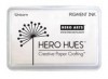
For this technique, you need one color dye ink pad. That’s it! You will also need one tool to use with it – a good white pigment ink. You could argue that that is another “color” of ink, but I really look at as a tool here. 🙂 And you can team it up with any color of ink.

061916-One-Ink-Layering9-Jennifer-McGuire-Ink

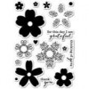
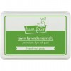
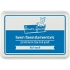
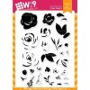
For the flowers, I stamped the first layer images of the WPlus9 Freehand Florals using a color dye ink. (Colors are listed in the thumbnails below.) I then stamped the same images directly on top using white pigment ink… and the white pigment mutes the color underneath… leaving a beautiful velvet look. I then stamped the next layer with the color ink followed by another layer of white. Finally, I finished with the last stamp layer with color.

So basically, I’m stamping that solid image using white pigment ink between each layer image. This allows you to lighten each layer of color that you put down so the next layer of color will look even darker.

061916-One-Ink-Layering1-Jennifer-McGuire-Ink

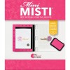
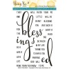
I finished off the cards by stamping the large sentiment from the Honey Bee Bless Your Heart Stamps using Black VersaFine and clear heat embossing it. (I have to say that this stamp set is by far my favorite of 2016 so far. I just love it!) Since I made several cards of the same design, I used my Mini Misti Stamping Tool to stamp all the greetings.

061916-One-Ink-Layering2-Jennifer-McGuire-Ink

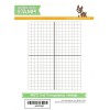
I added some Wink of Stella Clear Glitter Brush Marker to the flowers and die-cut the panel using a frame die from the Mama Elephant Dotted Details Dies. I also wanted to add splatter to my card but I have control issues. (Who’s with me!? lol) Instead, I used the Distressed Patterns Stamp Set by My Favorite Things and stamped the splatters using a silver metallic ombre ink pad from Hero Arts. This way I don’t have to panic on where the splatters land. Isn’t that shine fun?

061916-One-Ink-Layering7-Jennifer-McGuire-Ink

This technique will work with a variety of stamps. I chose to stamp a few of my cards using some new sets from Memory Box/Poppy Stamps. I also switched up the finishing touches in a few examples and used Nuvo drops as an accent. They come in a variety of colors and create drops similar to enamel dots. I like white the best! This card features the Memory Box Flourish Blooms Stamps…

061916-One-Ink-Layering6-Jennifer-McGuire-Ink

And this one uses the Memory Box Ornamental Butterflies Stamps…

061916-One-Ink-Layering8-Jennifer-McGuire-Ink

And here is the card I did weeks ago that I used as an inspiration for today’s cards. Sometimes when I am stumped on a design, I “lift” something I made in the past. It works!

061916-One-Ink-Layering4=5-Jennifer-McGuire-Ink

A white pigment ink pad is such a great tool to have in your crafty stash. There are so many techniques you can do with it, like this one. I hope you give it a try!

GIVEAWAY

How would you like to win the fabulous Honey Bee Bless Your Heart Stamp Set? For your chance, leave a comment below by 11:59pmEST on 6/29/16 telling me your favorite color of ink. (The winner’s name will be randomly selected, emailed and posted on my “Winners page” after the giveaway closes. International folks are eligible, too!)

SUPPLIES

Interested in the products I used? To make them easy for you to find, I have listed them below. (Compensated affiliate links used at no cost to you. Affiliate and product disclosure can be found here. All products were personally purchased except those with an asterisk. As always, this post was NOT sponsored.) Click on the letters below each picture to go to a favorite store: Simon Says Stamp (SSS), Ellen Hutson (EH), Amazon (AZ), etc.
Leave a Comment

695 thoughts on “Stamp Layering With One Ink Color + GIVEAWAY”

  1. Patty says:
    I love Tim Holtz’s Peacock Feather color a lot.

  2. lindapritchett says:

    Love your card technique using white pigment ink to soften. Favorite color ink right now is the fish tank blue. Love the honeybee stamp set!!

  3. Karen S. says:

    My favorite color right now is Butter Bar. I have white pigment ink, but I really didn’t know exactly what to do with it, but now I do. This technique is very striking. I look forward to your videos,. I have grown as a card maker since discovering your videos. Thank you for all your easy to understand instructions.

  4. Deepa lakshman says:

    I love oranges and yellows, my favorite stamp colors now.

  5. Krissie says:

    Beautiful cards. I love shades of greens and blues in general.

  6. Stephanie Sprague says:

    I hv a definite affliction for blue n aqua colored inks

  7. Ann says:

    I like creating cards in the aqua family. Such pretty colors and thanks for sharing this technique.

  8. Pat from sd says:

    I am really into stamping with shades of blues and greens. I also like making “rainbow” colored cards as well.

  9. Isabelle says:

    My favorite color is turquoise and being new in the card creation world, I’m still looking for the perfect one. I’ve got a Distress one which is very much to my taste, but I’m still looking for the perfect turquoise pigment ink.
    Thank you for the “white” tip !

  10. Toni C says:

    Thank you for this, I don’t have various shades of the same colour but I do have some layering stamps so this is awesome (and not was I was expecting, I thought you would be using generation stamping). I love greens, blues, purples and neutrals (like Crumb Cake as someone else mentioned) but if I could only have one ink colour it would be green – a mix of apple and lime.

  11. FanchonR says:

    Thanks for the chance to win….what a great prize. So hard to pick a favorite, I really like black of course, because I like to color my cards, pencils,chalks,inks. But besides that anything in pinks and aquas for me. Love this technique and plan to try it soon on my lotus blossom set.
    Thanks again.

  12. CathyL says:

    Awesome technique, Jennifer! I love blue and green inks.

  13. natgodfrey says:

    Awesome cards and technique. I love using versafine onyx black ink because of the shine that it leaves.

  14. linda bostedt says:

    What an awesome technique. I love these cards. My fav color, red of course!

  15. Maria says:

    In a word , black.

  16. Marillyn Arendt says:

    My favourite colour is turquoise – all shades of turquoise. Thanks for the white pigment tip.

  17. Rocio says:

    Great technique. Favorite ink color is Tim Hiltz Picked Rasberry.

  18. Carolee McCaslin says:

    What a great technique and video!!! I love any pink ink colors especially bubble gum:)

  19. Mary Laffin says:

    Great video and ideas. I always learn so much from you. I think my favorite colors are the purples and blues.

  20. Beautiful. My favorite ink right now is my Tim Holtz Distress ink in Vintage Photo.

  21. Rufus says:

    My favorite color of ink changes all the time. The only constant is a good rich dark black! Great stamp set thanks for the chance at it. Lots of neat cards for your stash!

  22. Pattie Hillenberg says:

    Hi..love your videos…my favourite colours are all of them…. purples are my most favorite but I really just love colour….Thankyou ?

  23. JulieC says:

    Beautiful cards! I always gravitate to pinks.

  24. Monica says:

    Clever technique! I like blue shades the best.

  25. Lynda Sharp says:

    I loved this only using one color and the white it was fantastic i also liked the Green Hills.
    I love all your work awesome

  26. Dolores Roberson says:

    I love the words on the honey bee set. It is so pretty on the light pink card you made. I love pastels

  27. PAULA BYNUM says:

    Love your cards!! Ink colors I love are crisp Reds and Navy!

  28. Laura says:

    Purple definitely

  29. Gwen says:

    This is such a great tip! Love your cards and this Blessings stamp set!

  30. Bridget W says:

    Love these cards! Beautiful! Right now, I’m really loving the aqua & teal/pool blue colors in ink. I also just painted my craftroom walls that color, too.

  31. Liz Mcallister says:

    Nice technique! Thanks. I don’t have a favorite inkmcolor. Just like children, they all have something about them that I love!

  32. Brenda A Carbon says:

    I like that pale tomato because it seems so versatile, especially when used with white ink.

  33. Gayle C says:

    Beautiful cards and always learn something new from your videos. I love Ocean Mist or Turquoise Sea inks. Thanks for the chance to win.

  34. Janelle H. says:

    Right now I’m loving Avery Elle Raspberry. I’m going to try this technique on that strong color. Thanks for the video.

  35. Carolyn S says:

    Lovely cards and wonderful sentiment set. My favorite color is any ole shade of blue.

  36. Rubina Pantoja says:

    I love shades of blue the best. Thank you for always sharing your wonderful ideas with the rest of the crafting world.

  37. Barb Kluwe says:

    I like a lot of color inks but my favorite would be in the pink family.

  38. trew says:

    Gorgeous cards. Now I can use the layering stamps I have! I like using orange and yellow inks.

  39. Rebecca says:

    You always make things look so easy! Right now I have been using pinks and yellow shades together…I love that combo with a touch of turquoise or lavender somewhere with it. The WPlus9 bouquet stamps are so fun….I am hooked on them! Would love to win the stamp set, love it!

  40. Josiane says:

    My favorite color ink is black – particularly Versafine’s Onyx Black.

    Thanks for the video & giveaway and hope you are enjoying your weekend!

  41. Laurie B. says:

    Beautiful cards Jennifer and a fun technique!! I gravitate to greens usually-bright ones like twisted citron.

  42. Julia says:

    Great technique! I’ll try it! Love it! I love turquoise the best. Thank you for your inspiration!

  43. Danielle says:

    Bamboo and lavender

  44. Beth Lane says:

    I love the pink layered rose, but my favorite colors to work with are the pool shades.

  45. Casie Williams says:

    I’m in a blue mood these days. My favorite is Hero Arts Ocean.

  46. Nana Griffin says:

    I like blue inks as a favorite.

  47. kate c says:

    Love this technique! Thanks for sharing such ‘simple’ ideas and beautiful projects! My favorite color right now is MFT Limeade green.

  48. jessica hart says:

    Every time I get a new color its becomes my favorite I am especially in love with purples and teals. Such a cool idea using the white over the color. What a great idea to get multiple uses out of our current stamp pad colors.

  49. Nancy G says:

    Practically any color of green ink floats my boat! I loved this video and learning this technique. Thank you!

  50. TracyM #6773 says:

    WOW – the white ink is a MAGICAL addition and your “controlled splatter” is AWESOME!!!
    THANK YOU SO MUCH for sharing with us Jennifer!!!
    YOU are ALWAYS SO KIND and SO GENEROUS with techniques and tips you share 🙂
    PS – given that I am just about to start my Copic colouring adventures, Memento Tuxedo Black is my favourite ink colour

Leave a Reply

Your email address will not be published. Required fields are marked *