Color Stamp Layering on Dark Cardstock

Hi! Today I share a technique for being able to do colorful stamp layering on dark cardstock. The look is unique and gorgeous!

[All supplies are linked to multiple sources in the thumbnails at the end of this post. Compensated affiliate links used at no cost to you. To watch the video in HD on YouTube, click HERE.]

Sometimes it is difficult to stamp colorful images on dark cardstock. This is usually done using pigment inks or the new Distress Oxide Inks since they are both opaque. However, most people don’t have many colors of such inks but instead have more dye inks. Today I show how you can get colorful stamping (including stamp layering) with dye inks on dark cardstock.

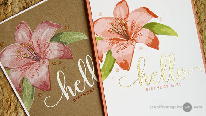
I created two cards – one on white cardstock and one on dark kraft cardstock – using the same stamps and inks. By doing this, you can see the different looks you get with this technique. Both feature the Gina K Layered Lilies and Simon Says Stamp CZ Design Hello You Stamp Sets… two must-have sets!

On a piece of Ranger Kraft Cardstock, I stamped the bottom layer of the Gina K Layered Lilies with Hero Arts Unicorn White Pigment Ink. After drying it completely, I stamped the remaining layers of the lily with WPlus9 Shell Pink, Gina K Peach Bellini, and Gina K Tomato Soup Dye Inks. By first stamping in white pigment ink (and drying completely), the dye inks have a “base” to sit on… allowing them to show up on the darker cardstock. Easy peasy! I did the same with the leaves, using Gina K Jelly Bean Green, Gina K Grass Green, and Gina K Fresh Asparagus Dye Inks.

Check out how that flower seems to glow, thanks to the white base of ink color. I also added interest to the center of the flower with gold heat embossing. I am impressed by the number of layers included in the Gina K Layered Lilies Stamp Set. It is easy to line up and so very detailed! I also added drops of Tonic Rose Water Nuvo Jewel Drops for pink-tinted rain drops.

The sentiment on the card is from the new Simon Says Stamp CZ Design Hello You Stamp Set. That “hello” is stunning! And I used the Gina K Happy Mail Stamp Set for the matching envelope.

I also created another card with the same colors of inks. However this time I skipped the white base of ink and just stamped directly onto the white cardstock. I am in love with those colors of ink. Swoon!

Here is a close look at the details of the flower…

For this card, I gold heat embossed the greeting from the Simon Says Stamp CZ Design Hello You Stamp Set… and again used images from the Gina K Happy Mail Stamp Set for the envelope.

Pretty amazing how these two cards look different in coloring, but use the same inks. Not sure which I like better!
NEW PRODUCTS

The Simon Says Stamp CZ Design Hello You Stamp Set is new from Simon Says Stamp… and were designed by the fabulous Cathy Zielske. Cathy has been a friend of mine for years and has recently jumped head first into cardmaking. Be sure to follow her! (She has been in the scrapbooking world for years and is hilarious!)

You can see all of the new CZ Design products HERE. Lots of great sentiments and word dies!

SUPPLIES

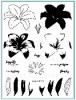
Want to find the products I used? To make them easy for you to find, I have listed them below. (Compensated affiliate links used at no cost to you. Thank you! Affiliate and product disclosure can be found here. All products were personally purchased except those with an asterisk. As always, this post was NOT asked for, paid, or sponsored.) Click on the letters below each picture to go to a favorite store: Simon Says Stamp (SSS), Ellen Hutson (EH), etc.


Leave a Comment

42 thoughts on “Color Stamp Layering on Dark Cardstock”

  1. Diana says:
    Hello Jennifer, thank you for sharing this tip. I love the look of the dye inks on the dark card stock. I will be trying this technique soon. God bless you for your kind heart and for sharing your talents. Diana

  2. Jen Hayes says:

    I don’t know which one I like better either. They’re both stunning!

  3. Monica says:

    So beautiful! You have given me some great ideas for a card that a neighbor gal (13 yrs old) has asked me to help her make for her mom & dad’s anniversary. Can’t wait to try it out!

  4. Roberta S. says:

    I love this flower & the Hello. Both cards are beautiful.

  5. grammasuzi says:

    Such great stamp sets! I would never have thought of building on the white. A super technique! Thank you!

  6. Michele W says:

    I agree that it’s tough to choose a favorite. Both cards are beautiful and I love that lily stamp. Thanks for another great video!

  7. Ann says:

    Both are beautiful – don’t think I can choose between them.

  8. Gail Anderson says:

    Both cards are beautiful. Great idea to stamp the white first. I’m going to give it a try.

  9. Barbmac says:

    Beautiful and mesmerizing! I don’t usually favor kraft cards but this one is a breathtaking stunner! Thanks for the tips!

  10. Judy says:

    Lovely cards! I love the way that using white pigment ink allows you to have a muted version of your color scheme.

  11. Stef Perry says:

    Love having another option for stamping on dark card stock, especially if you’re using a layering stamp. As always, thanks so much for sharing your wondeful creativity Jennifer!

  12. Debbie P says:

    Wow! Both of your cards are beautiful. I love them both.

  13. Julie Haedtke says:

    Amazing….love them!

  14. Sharon Jones says:

    Your cards are beautiful. Thanks for the tip on stamping with white ink first on kraft paper. I am going to try this technique. Love your videos. Thanks.

  15. Lagene says:

    I especially love how the colors look on the Kraft card!

  16. Colleen Howell says:

    Gorgeous cards, love the colors on the kraft card I will have to try this very soon

  17. renee milner says:

    I enjoyed your video of how to make these lovely cards! That flower layering stamp set is great.

  18. I love to use colored pencils on kraft card stock, but haven’t tried inks like this. They turned out beautiful and so different from one another. Thanks for another great video.

  19. MaggieB1983 says:

    Hi Jennifer ~ It’s hard to pick a favorite here because the results are so very different yet both are gorgeous. Thanks so much for sharing this beautiful stamp set released by Gina K. Her attention to every single detail in these lilies is amazing. Enjoy the rest of your week. ~HUGS~
    #kindnessmatters

  20. janet says:

    Both are beautiful 🙂

  21. Teresa Doyle says:

    These are both beautiful Jennifer and I love Cathy’s sentiment sets. I have one of her earlier sets and the fonts are awesome. She IS hilarious and her cards are great as well.

  22. smlittler says:

    Beautiful!! I just so enjoy watching your videos and your cards are always SO professional looking and gorgeous!

  23. Carol K says:

    both options are gorgeous. . . nice stamp set

  24. Lisa Tilson says:

    They are both beautiful Jennifer. It’s amazing how the same inks can look so different and I absolutely LOVE the look on kraft. I have pencil and Copic coloured on kraft before but not sure I have stamped on it?!!! I forget about all these wonderful techniques. Thank you the great video, Lisa xx

  25. siobhann says:

    This side by side comparison is awesome!!!

  26. These are gorgeous cards! Love them!

  27. ChristineZ says:

    Thank you so much for the white pigment ink technique! Love these cards.

  28. Tammy B says:

    Gorgeous! You can really see the details in the photos!

  29. Kbyrmcc says:

    Stunning cards! My wishlists at SSS and GK have lengthened once again 🙂

  30. ggnurse says:

    I was just thinking about the technique with white pigment ink on dark cardstock–haven’t done it in a very long time & now I have some great layering stamp sets to use. Thanks for the inspiration–these cards are both gorgeous! Gonna check out that sentiment stamp set–something I’m always looking for.

  31. Linda C. says:

    You did good, Gina would be proud. I too love both cards,however my favorite is the one on kraft because the flower just seems to glow. I was wondering if you tried the white pigment ink on white card stock if the dye inks would have the same glowing effect. Even though its white-on-white; if you’re using the MISTI, alignment wouldn’t be a problem. Have you tried this?

  32. Leanne in Cali says:

    Thanks for the great video showing how you made these two beautiful cards! Love that they are similar but different. Thanks for always sharing with us!!

  33. KimMJ says:

    Thanx ever so much for the video…I have been struggling with how to manage on my kraft paper cards! Those are simply stunning!

    My wish list just got a little longer 🙂

  34. Barbara-Jean says:

    Super cards. I especially like the one on Kraft card stock as that’s something I have yet to try! Thanks for the video.

  35. Miriam L says:

    Both cards are beautiful..

  36. Berina Febin says:

    Beautiful cards!! I love them both. Thanks for sharing this technique.

  37. Pattie Hillenberg says:

    I really like the one you did with the white ink but both are nice .😊

  38. LisetteCG says:

    Wow…I love these cards, they are beautiful.

  39. Lorraine Reynolds says:

    I can’t get over how beautiful these cards are. This must be one of the best ever layering sets – so much detail, so life like. I used to work on a flower farm that grew these – so I’ve seen more than a few!

  40. Farhana S says:

    Thank you for sharing! I need to try stamping on dark cardstock!

  41. Isela Cooper says:

    Hello Jennifer, I absolutely love the card and wanted to do it but when I went to the link to get the W9PLUS Shell pink dye ink wasn’t able to get it. (Link doesn’t work). I was so disappointed, is there an updated link where I can get this beautiful ink. Please, advise. THANKYOU!!!!

Leave a Reply

Your email address will not be published. Required fields are marked *